Blog
5 of the Most Popular Colors Used in Marketing
- 06/22/2022
- Posted by: Giovani Rome
- Category: Blog
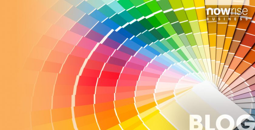
Did you know that individual colors have specific meanings within the realm of advertising? Not only do colors have meanings, but these meanings can be used to strategically connect with customers psychologically. An effective marketing strategy is one that implements this principle. Particularly when it comes to visual design. When color schemes are used to appeal to customers, they can enhance the popularity or identity of a brand.
Colors in marketing are a powerful tool that cannot be underestimated.
Beauty is In the Eye of the Beholder
Marketing Strategist Poulomi Basu advises that, “There are tons of studies on the psychology of color. On the effects it has on people. On average, each color represents an emotion, or a state of mind. So before you fixate on ONE color, try to understand the meaning of each. Choose a color direction with a feeling that you want your audience to connect to your brand.”
Here’s a quick thematic summary of colors which are prominently used in marketing:
Red
Red is the boldest and warmest color in marketing. It’s typically used to evoke ideas of love, urgency or intense appetite. When people see the color red, their attention is immediately grabbed.
Blue
Blue is the coolest and subtlest color used in marketing. Blue is typically used to evoke ideas of vastness (like the ocean), stability or dependability. When people see the color blue, they’re inclined to feel soothed.

Yellow
Yellow is a moderately warm color. It’s typically used to evoke ideas of cheerfulness, optimism and happiness. When people see the color yellow, they think about the sun. They think about the joyfulness and comfort that comes with basking in the sun.

Green
Green is also a moderately cool color. It’s typically used to evoke ideas of nature, forestry and money. When people see the color green, they think about resources. They think about necessities and amenities which tie into organic nature.

Purple
Purple is a slightly cool color. It’s typically used to evoke ideas of wealth, splendor and stature. When people see the color purple, they think about royalty.
Conclusion
Visual design is one of the most sensitive aspects of marketing and business. Unfortunately, the majority of amateur entrepreneurs use the wrong approach when it comes to visual design. Especially as far as color schemes are concerned. The best way to make sure that customers are attracted to a brand is by being methodical with color schemes.
If you like what you just read from our blog, you’ll love our free masterclass How To Create A Digital Marketing Campaign

Leave a Reply Cancel reply
[vc_row full_width=”” parallax=”” parallax_image=””][vc_column width=”1/1″][vc_widget_sidebar sidebar_id=”default”][/vc_column][/vc_row]
